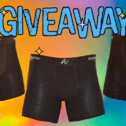
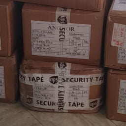
We are pleased to announce that our initial order has been placed! We purchased 1,000 pairs to test the market and get customer feedback on the existing design before placing a larger order. We think our customers will be very happy with the design and level of comfort; however, we are always looking for suggestions and for ways to improve our already great product. Here’s what sets us apart from our competitors:
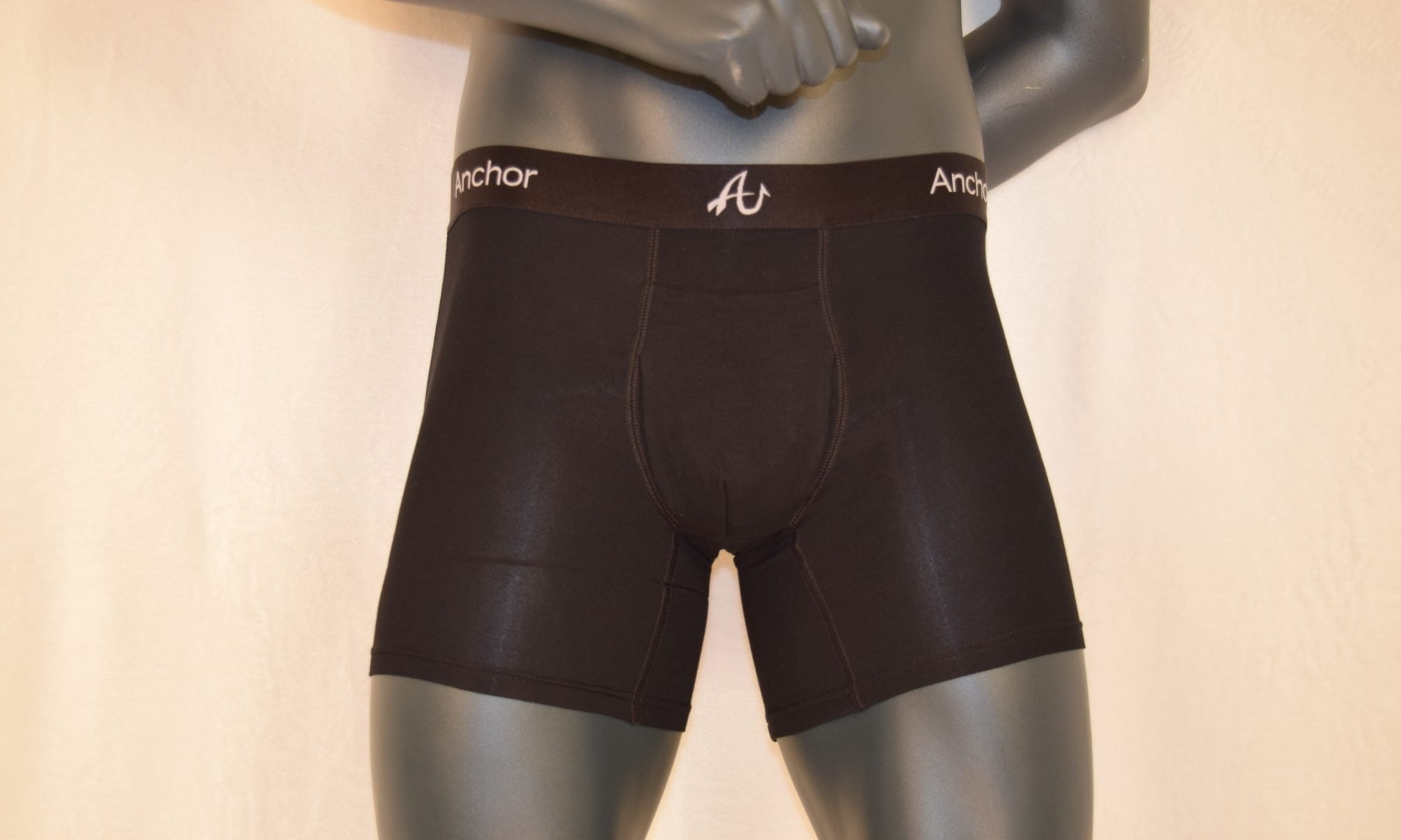
- Patented three-way fly
- Easy access in the bathroom and the bedroom
- Cool, breathable, four-way stretch fabric
- Anti-roll waistband and tear-a-way tags
- Anti-pilling and moisture wicking fabric
- Tearaway tags
- Anti-roll waistband
- Lightweight and quick drying
…my Anchor Underwear are the most comfortable underwear I have ever worn. On top of that I look and feel great wearing them!
Our patented design not only looks sexy and facilitates the ultimate functionality but it also provides the best fit available. Everyone we’ve spoken to has absolutely loved our three-way fly.
We decided, instead of going with the cheapest factory we could find to produce our underwear, we feel that we owe it to our planet, the workers that make our garments, and our customers that buy them, to use a sustainable and ethereal manufacturer. Wee chose Cute Dress Industries because:
We spent a lot of time trying to pick the perfect name for our company as well as picking a corresponding logo to match the company name. Most importantly, we wanted to be sure that we didn’t plaster some guys name all over the waistband of our underwear. Who want’s that? Instead, we wanted a strong name to represents our brand and we think Anchor Underwear nails it perfectly since it sounds like the only underwear that you should entrust to encase your family jewels!
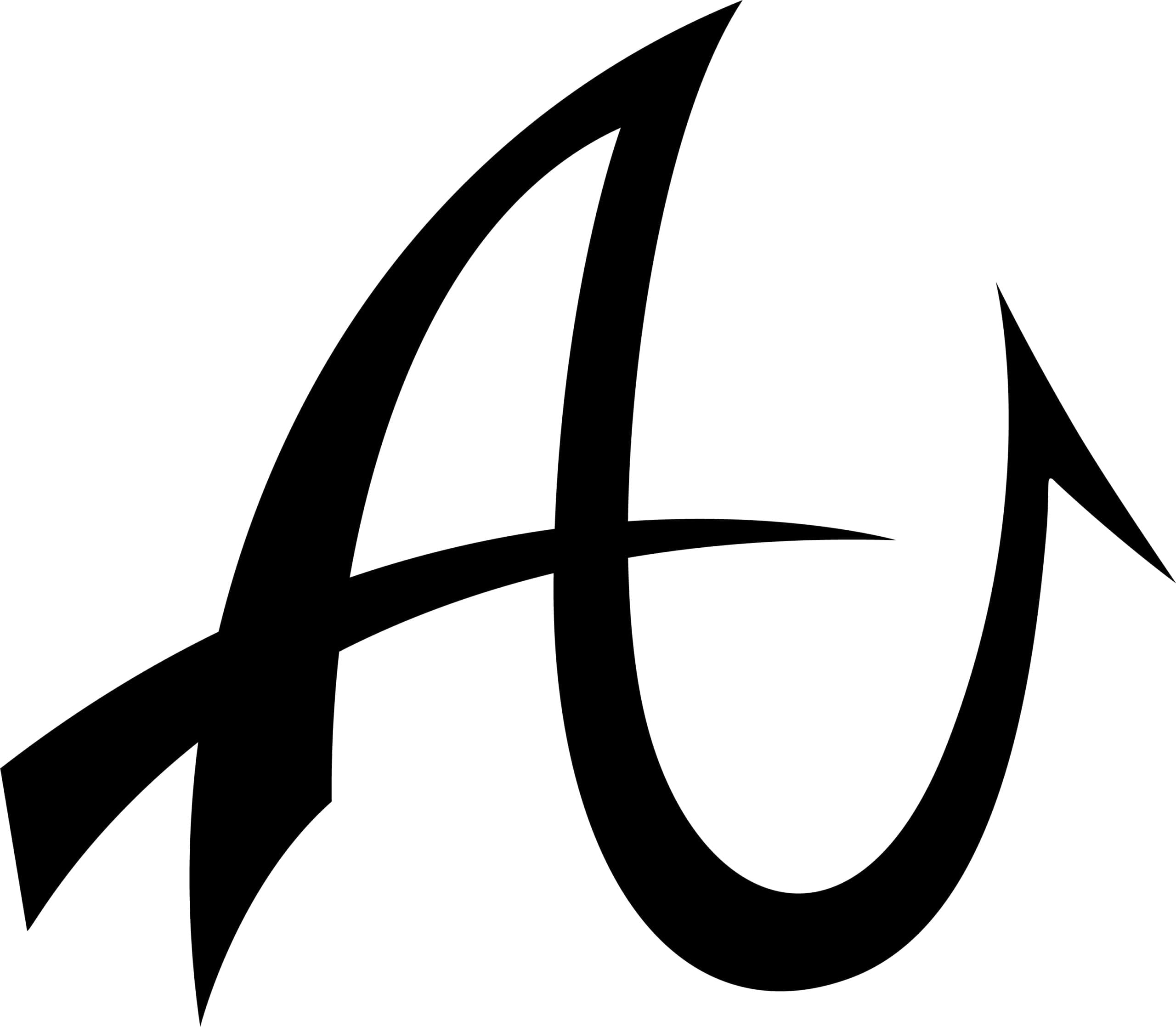
Once we picked the perfect name, we needed to come up with an accompanying logo design. After looking at a few different versions and revisions of possible logos, we decided to go with a design that included both the A and the U from Anchor Underwear. I wanted swooping letters that melded together.. After a few renditions I decided that I wanted the backside of the A and the entire U to sort of represent a fish hook partially from my love for the ocean and enjoyment of fishing and just being out on the water. From the many different versions of possible AU logos we think we sculpted a winner with our final choice!


